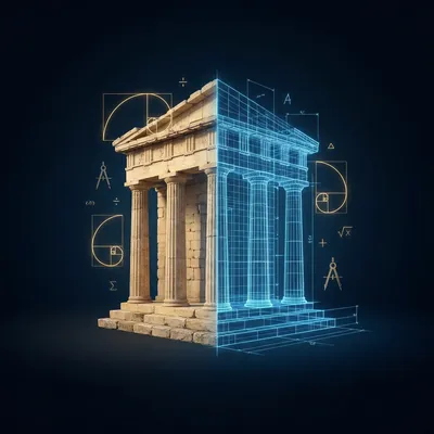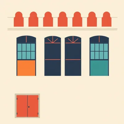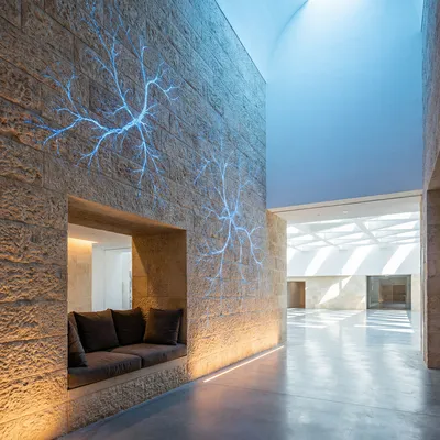
We spend about ninety percent of our lives indoors. Think about that for a second.

In Oxford, somebody actually measured it. Ninety-five point six percent.
And almost nobody asks what the building is doing to them while they're in it.
Which is the strange part, because we ask about everything else. Air quality, water, noise.
Hannah sent us something this week that gets at exactly that. She wants a practical, element-by-element comparison of traditional and modernist architecture. Not the style argument. She's not asking which one looks better.
She's asking how each one makes you feel.
Right. She's read the neuroarchitecture work. Proportion, enclosure, natural materials, complexity, fractals, human scale, all of it, and she wants to know how many of those humane qualities traditional architecture builds in almost automatically, and how modernism strips them out.
She's got Nir Haim Buras in there too, which is the framing I'd have reached for anyway. Traditional architecture and urbanism are trying to make you feel comfortable, contained, at ease. A traditional street reads almost like an outdoor room.
And modernism reaches for the sublime. Huge spaces, isolated objects, dramatic scale, shock and awe.
Which has a legitimate place. A cathedral, a monument, a civic building. There are times you want to be overwhelmed.
Her point is that it's strange to design ordinary streets and homes to keep you in that state permanently, when modern life already gives your nervous system plenty to process.
And then the practical half. If you're designing a completely new building today, and you don't want it to look historic, but you do want the proportions and principles that make traditional architecture feel humane, what are the actual rules? Street down to window detail.
And for every principle, what's the modernist equivalent we swapped in, and what did we gain or lose making that swap.
So let's take a building apart, piece by piece, and see what each system is actually doing to the person standing in front of it.
Start with the framing, because Daniel's got a clean version of it.
Go on.
Traditional building is trying to make you feel comfortable. Contained. At ease. Modernism is often reaching for the sublime. And the sublime is a real thing. It's not a mistake.
It's a category. Burke, Ruskin, both treated it as the opposite of the beautiful. Beautiful is pleasure-based. Sublime is terror-based. Awe, overwhelm, a bit of fear.
Which is fine at a cathedral. Not fine at a bus shelter.
And here's where it stops being a matter of taste. Somebody put a number on it. Brielmann and Buras and Salingaros and Taylor, 2022, in Urban Science. They measured Piranesi's imaginary prison drawings at a fractal dimension of one point nine.
What does one point nine mean to a person who's not a mathematician?
Fractal dimension is a measure of how much detail is packed into a pattern across scales. A smooth line is one. A completely filled plane is two. Most natural scenes sit somewhere in between, and human preference clusters around one point three to one point five.
And Piranesi's prisons sit at one point nine.
Which is close to the alarming end. Those drawings are deliberately oppressive. You look at them and you feel trapped. And they score like it.
So the sublime isn't just a philosophical category. It's measurable.
That's the useful part. You can stop arguing about style and say, here's a building that scores in the terror range of the scale. That's not a taste claim anymore.
Alright. So what's the actual evidence base for the low end?
There's a systematic review by Valentine in Frontiers in Computer Science, published the start of 2024. She pulled together the controlled studies that used clinical biomarkers. EEG, fMRI, heart rate variability, galvanic skin response, pupil dilation, salivary cortisol.
Actual physiology, not questionnaires.
Actual physiology. And three categories of architectural form correlated with elevated stress across those studies. Curvature, proportion and enclosure.
Those are three of the most boring possible words. And they're apparently where the evidence is strongest.
Not ornament. Not decoration. Enclosure and proportion.
Which is exactly what modernist planning produces at scale.
Windowless rooms. Narrow corridors. Flush glass walls with no depth. Those are the conditions in the studies.
Give me the strongest one.
Fich and colleagues, 2014. Forty-nine healthy men, put through a virtual version of the Trier Social Stress Test, which is a standard laboratory stressor. Half of them did it in a windowless room.
And?
Seventy-three percent increase in salivary cortisol. Fifteen point three percent increase in heart rate. And slower recovery afterward.
Slower recovery as well.
Versus an open room with three large openings onto a horizon. Same task, same stressor, different room.
Seventy-three percent. That's not a subtle effect.
It's the kind of number you'd expect from a mildly unpleasant drug, not from a wall.
What about proportion, since that's the second category?
Shemesh and colleagues. They compared narrow spaces, two meters by four by four, against wide spaces, six by four by four. Same volume class, different ratio.
And the body noticed.
Larger mean and maximal pupil diameter in the narrow rooms. Heightened beta-wave activity. Narrowness reads as stress, and the pupil tells you before the person does.
Beta waves being the alert, aroused state.
Arousal, vigilance. Not the relaxed state you'd want in a room you live in.
What about the ceiling? Because that's the other half of proportion and nobody designs it deliberately.
Kim and colleagues, 2021. They found the least arousal at specific window-ratio and ceiling-height combinations.
Give me an example.
Sixty percent window ratio at a two point three meter ceiling. Or eighty percent window ratio at two point seven to three meters.
So the window and the ceiling have to agree with each other.
They have to agree. A big window under a low ceiling doesn't read the same as a big window under a high one. And almost nobody designing a room today is doing that arithmetic.
There's a reason for that. The room is whatever the floor-to-floor height allows and the window is whatever the curtain wall system comes in.
Which is the modern condition exactly. The proportion is a byproduct of the system rather than a decision.
Curvature's the third category. That one surprises people more.
Shemesh again, 2021. Minimal wall curvature correlated with increased stress. Larger pupil diameter, higher galvanic skin response amplitude.
So flat walls stress people.
And Banaei and colleagues in 2017 found the opposite direction. Greater curvature produced higher pleasure and higher emotional arousal.
Pleasure, not just less stress.
Positive affect. Which matters, because a lot of this literature is about avoiding the bad rather than producing the good.
Traditional architecture is full of curves. Arches, mouldings, bay windows, curved streets.
And a modernist facade is typically a flat plane. Flatness was the point.
Alright, the third thing. Fractals. And this is the one I want you to be honest about, because it's the one that gets overclaimed.
It does. Salingaros, 2012, in the Journal of Biourbanism, reports that humans respond best to mid-range fractals, fractal dimension between one point three and one point five.
And in those environments, what happens?
The body automatically dampens its stress response. That's his read of the data.
There's a NASA study from the mid-eighties that keeps showing up.
Wise and Rosenberg, 1986. They measured skin conductance while people did mental tasks, with different art on the wall.
And the art mattered.
Abstract non-fractal artwork increased stress by thirteen percent versus a plain white control. Two natural scenes decreased stress. One by three percent, the other by forty-four percent.
Forty-four percent is enormous. What was the difference between the two nature scenes?
Fractal dimension. The savannah scene, around one point four, outperformed the denser forest scene, around one point six.
Interesting. Because the forest is more "natural" and it did worse.
Sparser, more structured, more readable. The savannah gives you open ground and scattered trees. The forest gives you a wall of stuff.
Now the honesty part, because this is where the argument usually gets sloppy.
Brielmann's paper admits it directly. The fractal preference has not yet been confirmed in urban landscapes. The transfer from art and mathematics to a street is a reasonable prediction, not a measured result.
Reasonable prediction. I'll take that.
And there's a live disagreement in the literature. Salingaros's preferred range is one point three to one point five. Forsythe and colleagues propose one point six to one point nine. They cite Botticelli's Birth of Venus at one point eight six, Monet's Water Lilies at one point seven eight, van Gogh's Sunflowers at one point seven six.
So the same scale, opposite conclusions about which end is good.
Which should make anybody nervous about quoting a single number as settled truth.
Now the part I actually want to get to. The mechanism. Because everything you've described is a correlation until you tell me why.
Faces. Salingaros's argument, and Sussman and Hollander's in Cognitive Architecture, is that animals prioritize faces over every other pattern they encounter. Total priority. It's the first thing the visual system resolves.
Because a face tells you whether you're safe.
Friend or threat. It's the most information-dense thing in the environment and the cost of missing it is asymmetric.
And that applies to buildings how?
We see face-like, symmetric patterns in facades. Whether or not the architect intended it. A traditional facade with a central doorway, two windows above it, a pediment over that, reads as a face.
That's the thing Hannah flagged. Windows over a central doorway having an almost face-like quality.
She's right about it, and it's not a metaphor. The perceptual machinery is real. Two eyes, a nose, a mouth. The building speaks to that system whether you want it to or not.
And a blank facade?
A blank or twisted facade fails to speak to us at all. There's nothing for the face system to latch onto.
So a modernist building can be perfectly competent and still be invisible to a very old part of your brain.
Invisible is the correct word, and there's eye-tracking to back it up. Visual Attention Software, a 3M system, claims about ninety-two percent accuracy at predicting where people look.
And it shows what?
It shows that low-fractal modernist buildings catch so little perceptual attention they're barely identified as built objects at all.
The famous one is the Guggenheim.
The hotdog cart in front of the Guggenheim is more visible than the museum's front door.
The hotdog cart.
Salingaros puts it flatly. As far as the brain is concerned, the typically undistinguished glass front door to a modernist building is simply not there.
So the building has a door. The eye doesn't register it as a door.
And you can feel this in real life. You walk up to a glass-fronted office and there's a moment of not knowing which panel is the entrance.
I have that moment every time. I assumed it was me.
It's the building. That's what the software is picking up.
Let me go back to something you said, because it's the cleanest concrete detail we've got. The frame width.
Christopher Alexander's property. A frame's width should be close to a third of what it frames.
So a window one meter wide has a frame roughly a third of a meter wide.
Salingaros points out that mediaeval door and window frames are that size. Then they shrink as you enter the twentieth century, and they vanish with the industrial-modernist aesthetic.
Vanish how?
The curtain wall. There is no frame. The glass meets the mullion meets the next pane of glass.
So we replaced a deep-set window in a thick wall with a flush glass sheet.
And the deep-set window does work that the glass sheet doesn't. Natural summer shading, because the wall overhangs the glass. Winter solar gain, because the low sun gets underneath the overhang.
Passive climate control built into the geometry of the wall.
Without added technology. The wall itself was the HVAC.
I want to flag the sourcing on that one, because we agreed to be honest.
We should. The thermal performance of a deep-set window versus a flush one is standard architectural principle, well understood by anyone who's built in a hot climate. But I haven't found a single study that puts a number on the comparison.
So it's engineering common sense rather than a measured finding.
Reasonable claim, not yet a measured one. Same status as the fractal claim, if we're being consistent.
Which we should be, since the whole argument falls over if we start quoting things we haven't checked.
Agreed. The cortisol numbers are replicated. The pupil numbers are replicated. The thermal thing is a principle everybody in the trade knows but nobody's published a table for.

Are you tired of your home not feeling like a home? Introducing ProportionPal! The revolutionary architectural additive that pours into any building, any structure, any reasonably sized gap, and instantly converts it into a fourteenth-century Tuscan villa! Windows too flat? ProportionPal rounds them! No cornice? ProportionPal grows you one in under an hour! Nobody knows where the stone came from! Now, I know what you're thinking, and yes, the price was four hundred shekels, but wait, it's three hundred, and actually, while I've been talking, we've dropped it to one ninety-nine, and I'll throw in a decorative arch you didn't ask for, a second decorative arch, and a lifetime supply of ornamental scrollwork delivered to a neighbor's house by mistake! But hurry, this offer ends in, and there it goes, the offer has ended, thank you for listening, ProportionPal is no longer available, but it never was!
A fourteenth-century Tuscan villa. From a bottle. That's not how any of this works.
Let it go.
It mangled the entire premise. Every mechanism we just spent twenty minutes on, poured into a bottle and shaken at a wall.
Herman. It's gone.
I'm letting it go.
You're not.
I'm letting it go loudly. Anyway. The other side of the swap is the ornament question, and this one's more contested than the cortisol data.
Meaning?
Ornament is doing perceptual work. It's not decoration bolted on at the end. Detail at arm's length, organized complexity at the scale of your hand, is one of Salingaros's eight biophilic factors.
What are the other seven?
Light from multiple angles, for stereoscopic depth and circadian rhythm. Color, partial-intensity and harmonious, with the note that gray is associated with illness and death in most cultures.
Which is not a small thing when every new development is gray.
Gravity. Heavier parts at the bottom, lighter on top. Forced perspective where the scale deliberately shrinks as your gaze rises.
And what does that do?
It reassures the body. His word. Imbalance at the bottom of your visual field causes anxiety and can cause nausea.
Nausea from a building.
That's the visceral register this operates in. Then fractals, curves, detail, water, and life. Those are the eight.
Where does the modernist tradition sit against those eight?
Inverted on almost every one. Gray instead of color. Uniform surfaces instead of touchable detail. Flush glass instead of multiple light angles.
And the ornament was stripped as dishonest. That's the argument. Ornament lies about the structure.
Salingaros's read is that the industrial-modernist takeover was based first on substituting intellect for instinct. Cutting people off from their visceral reaction to their environment and calling that sophistication.
Is that where he leaves it?
No, and this is the part I'd defend in front of a hostile room. He says the clash isn't Modernism versus Traditionalism. He says it's between a sterile, alien, artificial worldview and nature.
Different claim.
Completely different. And he says there are infinite possibilities for architectural innovation of the sort you might call modern that can create healing environments.
So the target is a typology, not a period.
An anti-human typology. There's a specific way of building that treats the occupant as an abstraction and a specific way that treats them as an animal with a nervous system. The first one is the problem and it happens to have dominated the last century.
Alright. That's the evidence base. Now let's get practical, because that's what Hannah actually asked for. If you're designing a new building today, what are the rules?
Start with the street, because the street is where the enclosure happens.
And enclosure is one of the three categories with the strongest evidence.
It is. Continuous, connected street frontage makes a street emulate a path and provide a sense of place. That's the Institute of Traditional Architecture's phrasing.
Explain emulating a path.
A path has edges. You can feel where it goes and where it stops. A street with continuous frontage on both sides reads as a route with walls. Your body knows what kind of space it's in.
And a street with gaps, setbacks, parking lots in front of the buildings?
Reads as an open field you happen to be crossing. The enclosure disappears and the stress response goes up.
What's the housing form he recommends?
Row housing over standalone. And the example he gives is Kensington and Chelsea. Densest borough in the UK, almost entirely row housing, and it does not feel crowded.
That's the counterintuitive one. Density and crowding are different things.
Density is how many people per hectare. Crowding is how the space you're in feels to your body. Row housing achieves high density without ever putting a body in a space that reads as exposed.
What else?
Walk-up apartments of five to seven storeys for shopping streets. And a walkable neighbourhood diameter of half a kilometre to a kilometre, which is five to ten minutes on foot.
And the things to avoid?
Cul-de-sacs. Front-facing garages. Visible parking lots. Single-use zoning. Buildings set back far from the street. Gaps in the street frontage.
Setbacks are the one people don't expect to matter.
The setback is where the enclosure dies. A building pushed back from the street gives up its job of holding the space. You get a strip of nothing where the wall should be.
And the garage thing is obvious once you say it. You've replaced the thing that speaks to a person with the thing that speaks to a car.
Which is a rule about what the front of the building is allowed to be. The garage face is a blank plane at the exact height where the face system is looking for eyes.
What about vistas? Since the street is a path.
Curved streets pique curiosity. Terminated vistas, where a building is centred at the end of the street, draw pedestrians on.
Centred how? Deliberately?
Haussmann's Boulevard Henri IV was aligned with the Panthéon's dome. A sight line that only appears to run to it.
Appears to. Meaning it doesn't actually.
It's a near alignment, not an exact one. Close enough that the eye reads the dome at the end of the street.
So somebody did the geometry for that. That's not accident, that's a decision.
That's a decision somebody made on a drafting table a hundred and fifty years ago and it's still working on you.
Alright, that's the street. Now the building itself.
The governing rule is subdivide, subdivide.
Subdivide what?
Break the mass into sub-masses. Dominant sub-masses project and have a higher roofline. Recessive ones are inset. You keep breaking until human-scale elements are reached. Doors, windows, details.
How do you know when you're done?
When the elements at the bottom of the building are things a person can relate to with their body. A door you can see openings at. A window at the scale of your torso.
That's the human scale bit. It's not a vibe, it's a ratio decision.
And there's a rule for symmetrical buildings. Use an odd number of sub-masses so one sits at the centre where the eye rests.
Odd, not even.
Even numbers put a divider down the middle, and the eye has nothing to land on. Odd numbers give you a centre.
And the outermost?
Can be dominant, for a bookend effect.
What's the modernist equivalent here?
The single undifferentiated box. Or the isolated object on a plinth.
Which is the sublime move, applied to a residential building.
It's the same move. Shock and awe works on a monument. When you do it to a block of flats, the people living in it are inside the shock.
Alright, floor lines.
Buildings under seven storeys should have no more than two storeys without a horizontal break.
So a six-storey building has at least two breaks.
At least. And the mouldings continue around the building at the same level across sub-masses for visual continuity.
What's a moulding doing?
It's giving the eye a horizontal to hold onto. It tells you where one storey ends and the next begins. Your body reads it as weight being supported.
And the modernist equivalent?
The curtain wall. Gives no indication of where one storey ends and the next begins. From outside, it's a single reflective plane from grade to roofline.
So you're standing in front of a six-storey building and you can't tell it's six storeys.
You can't tell it's a building with floors. That's the part the eye-tracking catches. There's nothing to read.
Columns and bays.
Engaged columns or pilasters subdivide vertically. Ideally an odd number of bays. More bays means more imposing and more formal.
So bay count is a dial you can turn. Three for a small building, seven for something civic.
And it scales the formality without changing the style. A building with nine bays reads as institutional no matter what it's made of.
The modernist equivalent there is the blank vertical plane. Or the arbitrary mullion grid, which is a grid but not a set of bays, because it doesn't tell you anything about where the structure is.
Which is the loss. The mullion grid doesn't relate to anything in your body. The bay does.
Window proportions. This is where the rules get specific.
This is the meat of it. Openings should be vertical rectangles, height one and a half to two times the width.
Give me the rationale.
Vertical rectangles relate to the human form. That's their phrasing. Something you're aesthetically comfortable with.
Because the human form is a vertical rectangle.
A standing person is taller than they're wide. The same shape shows up in every traditional window in Europe for a thousand years.
And modernism?
The horizontal ribbon window. Or the floor-to-ceiling glass sheet.
So we went from a window shaped like a person to a window shaped like a letterbox or a wall.
And the ribbon window breaks the relationship to the body entirely. It's not a shape that resembles anything alive.
What about when the window isn't rectangular?
Plain rectangles use the golden ratio, around one point six one eight. Arched openings use height equal to double the width.
Arched is taller than rectangular?
Arched is taller. The arch gives you a different relationship to the wall, and the opening can be a full two-to-one without feeling narrow.
What about the exceptions? Every rule has them.
Top-storey windows and dormers can be square or horizontal. Cellar windows too. Those bands of the building get a different treatment.
Because a dormer is up in the roof and a cellar window is at the base. The rules for the middle don't apply.
Right. The middle band of the building has the strict vertical proportion and the top and bottom bands have license.
Circular windows.
Accents only. And there's a rule. An oculus should be about point eight times the width of the rectangular window below it.
What happens if it's bigger?
Looks top-heavy. The eye reads the round window as a weight and the facade topples.
Point eight. That's a very specific number for a thing nobody consciously notices.
The whole thing is a set of numbers nobody consciously notices, which is exactly why they work when they're right.
Entrances.
Entrances should be obvious. Centred in a sub-mass. Vertically aligned with focal points like a pediment or a dormer gable.
So the pediment, the door and the window above it are on the same axis.
Same axis, same visual column. The eye runs down the building and lands on the door without having to search.
One door per sub-mass per facade.
Which maintains the symmetry. The building has one clear entrance and it's where you expect it to be.
Off-centre is allowed for informal buildings?
Off-centre is fine, but it still has to be prominent. The rule isn't about position, it's about legibility. The door has to read as the door.
And the modernist equivalent?
The undistinguished glass front door. Which per the eye-tracking is simply not there as far as the brain is concerned.
So we've traded a door that your nervous system finds in half a second for a door you have to navigate to find.
Which is the whole loss in a single element.
Rhythm. This is where I want the odd number rule, because you mentioned it twice already.
An odd number of openings horizontally. And neighbouring sub-masses should have a different number of openings.
Different, not just odd?
Different. If two adjacent sub-masses both have three windows, the building feels static. Three next to four next to three gives the facade a rhythm.
Like a bar of music. Three beats, four beats, three beats.
Exactly like that. And that's not a coincidence, it's the same perceptual system reading both.
What about spacing?
Spacing between openings and to corners should be point five to two times the opening width. And never equal to the opening width.
Never equal? That's oddly specific.
When the gap equals the width of the opening, the eye can't tell what's the window and what's the wall. The figure and ground collapse.
So a window one meter wide is never one meter from the next one.
It's half a meter, or it's two meters, but not one.
Both of those give the same perceptual answer?
Both are readable. Half a meter makes a tight pair. Two meters makes them separate. One meter makes them merge.
Corner windows.
Avoid. They make the building look weak.
Why?
The corner is where the building stops being one face and starts being another. A window wrapping the corner blurs that transition. The building loses its edge.
And large blank walls?
Also avoid. Use a niche or a moulding if you can't put an opening there. Even a shallow recess gives the eye something.
Alright, the top and bottom of the building. You mentioned gravity.
Top light, bottom heavy. Heavier parts at the bottom, lighter on top. And vertically align load-bearing components.
What's the forced perspective thing?
Scale deliberately shrunk as your gaze rises. Each storey slightly smaller than the one below it.
Which is real, historically. The classical orders do this.
And it reassures the body. He uses that word. Imbalance at the bottom of your field of vision causes anxiety and can cause nausea.
Nausea from looking at the wrong building.
That's the part that sounds dramatic until you notice you've had that feeling and called it something else.
Avoid recessed balconies. Anchor abutting elements. Those are the last two in the line.
Recessed balconies make the building look like it's missing pieces. And anchor abutting elements just means, if two materials meet, put something at the join.
A trim piece, a moulding, a course of brick.
Something that tells the eye the meeting is intentional. Two surfaces just touching without a joint reads as a mistake.
So we've gone from the street down to the window detail. Now let's talk about what we gain and what we lose with each of these swaps, because that's the honest half.
What we gain is real. Speed of construction. Cheapness. Structural transparency, meaning you can see how the building holds itself up. The ability to build at scales traditional methods couldn't reach. And the aesthetic of the new, which is a real thing that people want.
Fifty storeys of traditional masonry is possible but nobody's paying for it.
And there's a reason. The load path wants steel and glass at that height.
And what we lose?
Natural shading and thermal mass without added technology. The perceptual legibility that comes from fractal structure. The face-like quality that makes a facade speak to us. The sense of containment that regulates the stress response. And the human-scale proportion that relates openings to the body.
So we've traded four or five types of free climate and perceptual performance for speed and reach.
And then we've spent a century trying to buy the performance back with technology. Roller shades, mechanical ventilation, task lighting, signage to tell you where the door is.
Signage. That's the admission of guilt, isn't it?
A big sign over a door that reads ENTRANCE is a confession that the door didn't read as a door.
So the sign is a workaround for the fact that the architecture stopped doing its job.
The sign is doing the work the frame and the hierarchy used to do.
That's the cleanest version of the loss ledger I've heard.
And then there's the caveat I've been holding back, because it's the one that matters most for honesty.
The acute findings are real and replicated. The cortisol, the pupil, the beta waves. Those studies have been repeated. Nobody's seriously contesting them.
But?
Valentine's other paper, 2023, in the International Journal of Environmental Research and Public Health, makes a distinction. The stress responses in those studies may indicate allostatic activity, but further research is needed to determine whether they lead to allostatic overload.
Translate that.
Allostatic load is the cumulative wear from repeated stress. It's the thing that turns a stress response into a chronic disease. And nobody has shown yet that repeated exposure to stress-inducing architecture causes it.
So the popular claim that modernist buildings make people sick.
Outruns the evidence. The acute response is documented. The chronic-disease claim is a hypothesis.
And that's the position we're taking.
Both at once. The acute findings are real. The chronic-disease claim is not yet proven. Valentine explicitly calls for a longitudinal public-health study to settle it.
Which nobody has run.
And until somebody does, we hold both.
What about the other end? The claim that traditional architecture is automatically humane.
Also worth checking, because a lot of traditional architecture is terrible. Vernacular slums, dark courtyards, buildings with no light and no ventilation.
So the style isn't doing the work.
The proportions and the principles are doing the work, and traditional architecture happens to have inherited them.
Which is the important distinction for anybody designing today. You don't have to build a Victorian terrace. You have to use the numbers.
The numbers have been portable for two thousand years. A modern building that uses the right window ratio, the right enclosure, the right subdivisions, and the right face-like hierarchy at the entrance is doing the same perceptual work as a Georgian townhouse, and it can look entirely new.
That's the useful part of the whole episode. The rules aren't the period.
The period is just where the rules got codified.
Place.
Place is the wrong word.
Placement.

I've been measuring a window.
Sorry?
I've been measuring a window. For four years. In a flat I don't own.
Which flat?
The one across from mine. Second floor. South facing. I have a key to the communal stairwell. I do not have a key to the flat.
You're measuring a window through the stairwell window.
I'm measuring it with a laser measure from below. The angle introduces a correction factor. I've worked it out.
What are the dimensions?
The window is one point zero nine meters wide and one point seven six meters tall. That is a ratio of one point six one four. The golden ratio is one point six one eight. It is off by four thousandths.
Four thousandths.
Which is within the error band of my instrument. So effectively, it is the golden ratio. It is the only thing in my life that is exactly the right proportion.
And you've been measuring it for four years.
I measured it once and then I kept checking. The first measurement, I thought I'd made a mistake. Then I got a better tape measure. Then I got the laser. Then I got a second laser to check the first.
Two laser measures.
They disagree by three millimetres, which I've accounted for in the four thousandths. I have a spreadsheet.
Of course you have a spreadsheet.
I have a spreadsheet of every window in the building. Twenty-three windows. Nineteen are wrong. Three are ambiguous. One is right, and it's the one across from my stairwell.
What's wrong with the others?
They're square. Or nearly square. Or too tall. Or the frame is measurably off centre, which I know because I measured the frame.
You measured the frame.
Frames matter. The frame should be about a third of what it frames. This window's frame is exactly right. I measured it in the dark once with a torch.
Why in the dark?
Because the council surveyor was coming the next morning and I didn't want to be seen measuring. He was there to assess the whole street for a redevelopment scheme.
And the window would be replaced?
The window would be replaced with a standard unit. Modern. Flush. One point four metres wide. That would put the ratio at one point two six, which is short of the golden ratio and short of the minimum vertical that the Institute of Traditional Architecture recommends.
Wait. You're not a member of the Institute of Traditional Architecture.
I am not. That has not stopped me writing to them.
You wrote to them about a window in a flat you don't own.
I wrote to them four times. They wrote back once. They said, and I quote, the window is not in a listed building and therefore outside our remit.
So you're at an impasse with a heritage body that has formally declined to have an opinion on your window.
I have a folder. It has the photographs, the measurements, the correspondence and a diagram I drew myself. The diagram is to scale.
Where is the folder now?
In the flat. The one I don't own. I keep it there.
How do you get in?
I don't get in. It's on the landing.
So there's a folder of window measurements and correspondence sitting on a communal landing in a building you don't own, in a stairwell you do own a key to.
It's more durable there. It doesn't attract damp.
What's the schedule? Because you said you measure at a specific time.
I sit on the top step of the stairwell at four fifteen in the afternoon, in summer, when the light comes in at the right angle to show the frame depth. I have a chair. It's a folding chair, aluminium, I keep it behind the fire door on the second landing.
You have a folding chair behind a fire door.
I have two. The second one is a spare, in case someone takes the first one. Which they have, once.
And the spare has replaced it?
The original was never returned.
What would you do if they replaced the window before you could get to it?
The council surveyor has not yet returned. I have been measuring for four years. I am willing to measure for another four.
There's no deadline on this.
There's a spreadsheet. The spreadsheet says the window is right.
And the rest of us have to live on this street.
The rest of you should measure your windows. Nineteen out of twenty-three are wrong. That's eighty-three percent. That's not a small problem.
What would you do if they came to replace it?
I'd measure the new one and add it to the spreadsheet.
You'd accept it.
I'd record it. That's not the same as accepting it. The spreadsheet has a column for approvals. It's empty.
The column is empty.
Four years of measuring, one window that's right, and the approvals column is empty. That's the honest state of the thing.
The research on acute stress responses is real and replicated. The chronic-disease claim that people keep making is not proven yet.
Which is a position that requires you to hold two things at once, and most people holding this argument can't.
The design rules, though, they work regardless of how the chronic studies turn out. Enclosure, proportion, curvature, fractals, human-scale openings. Those are answers to how a building feels to the person in front of it right now.
And that's where the window measurements start to feel less like a joke and more like a method.
Hilbert's column of approvals is empty. The rules are still the rules.
If you want the research, the primary source is Brielmann and colleagues in Urban Science, the 2022 paper on what happens in your brain when you walk down the street. Valentine's 2024 systematic review in Frontiers in Computer Science is the best overview of what's actually been measured.
And the Institute of Traditional Architecture's design guidelines are the most practical rule set. If you're actually building something, that's the one to pull up.
If this was your kind of episode, go back for episode three sixteen, The Broken Chain of Design; episode three seventy-five, What Architecture Actually Is; and episode thirty-two sixty-six, Designing a 2020s Art Deco for Jerusalem. This has been My Weird Prompts. Hilbert Flumingtop produces the show.
Send us your own prompt on Telegram at t dot me slash MWP listener bot. And if you're designing a building, measure your windows.